Light, Camera, and Trailer! | Crystalled Bullets - Dev Diary
In Today's Dev Diary, I will talk about how I made the trailer and a bit of progress on upcoming cave stuff. This article is a transcript of The Crystalled Bullets Dev Diary Video adjusted as a text article.
Join the Discord Server, and come hang out with us!
So, These days I'm making assets like 3D Models, maps, and enemies for cave-themed Maps. I'm not showing you all of them right now. Since I have to post it on Twitter as a weekly Development Update.

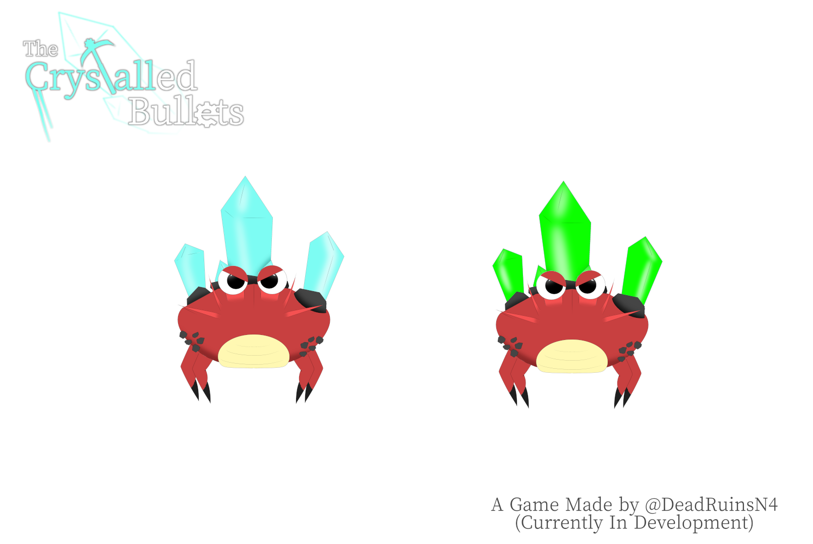
What I can show you right now is Crystal Crab. This monster hunts you down gets close to you, and explodes! You must bring it down with a compatible gun to their enemy. like Red/Flame Pistol for Green/Poison Crystal Crab.
I want to maintain the game's pace by alternating combat situations with human enemies, or creature enemies. Just like the original Half-Life and Metro 2033/Last Light did. You wanna see more of the Work In Progress stuff now? then just come over to my Discord Server and hang out with me. (Yeah, It's a shameless cross-advertisement. I must admit.)
Anyway, When I finish some Cave-Themed Map stuff, and several other stuff like the button prompt menu interface and all that, I'm going to release the game's Demo. and I target the release date this year. Currently, that's this year's resolution.
Okay, Now Let's move on to today's main topic. I want to make today's Dev Diary quicker word than usual. I'm more interested in Game Development rather than video making. Let's talk about the creation of the first trailer.
I set two objectives for the First Trailer. First: It needs to tell the main rules of gameplay. Second: It needs to help viewers grasp the game's story and tone.
As for the time limits, I set to "before 2024".
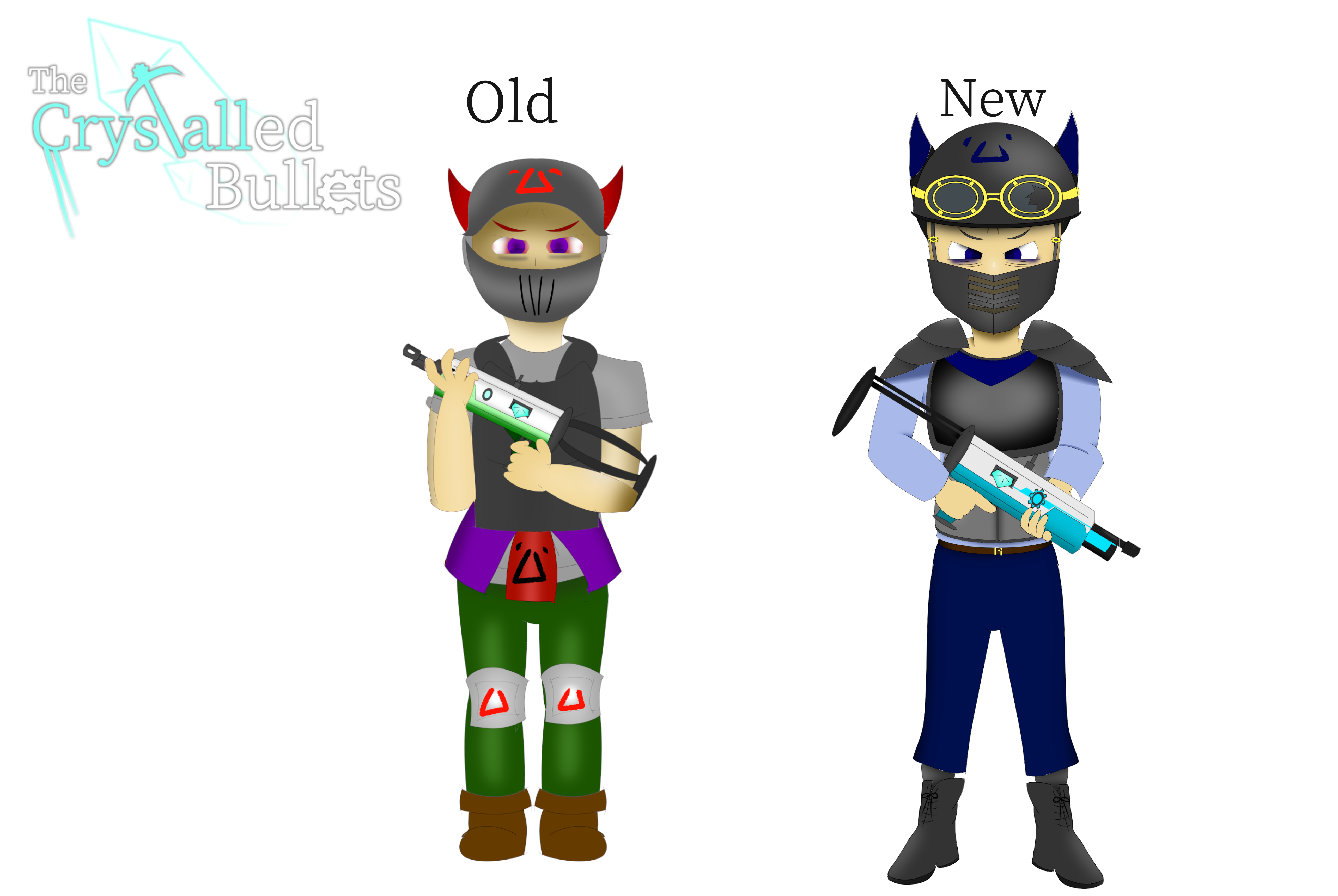
Before I'll be able to make a trailer for the video, I wanted to brush up on some work to make the game look good enough to be presented in Trailer. First, I decided to brush up on Male Enemy Soldier's Design. Especially regular ones. I mean, look at it! The arms and fingers are badly drawn, and his clothes' look is a mess, It's obvious that He needed some improvements in his design.

Other than that, I wanted the two girls' features in this game, Krocca, and Accone. to appear in the trailer as well. so I made some stuff using them to be shown in the trailer. I wanted Krocca features as a companion, so I added a feature to appear as a helper of the player. As for Her talking sequence As a placeholder, I'm using an AI text2speak called "VOICEPEAK". 'cos obviously I have no money to hire a real voice actor. Still, the tool is commercially useable, so I can ship with it if I really can't get my hand on the real voice actor. (If there are any Japanese people watching who would like to help with the voice-over, please come and help me. Wink, wink.) As for making all those lip-sync animations, It took a significant amount of effort but looked convincing and it was worth trying.
As for Aconne, I made these sprites because I wanted to show that Accone is being imprisoned. To tell viewers that she is one of the victims of these guys. I'm planning to make this girl a companion just like the aforementioned Krocca as well, but It's not the highest priority to implement such a feature right now.
I made some new maps too. So the trailer could have various variations of maps to show.

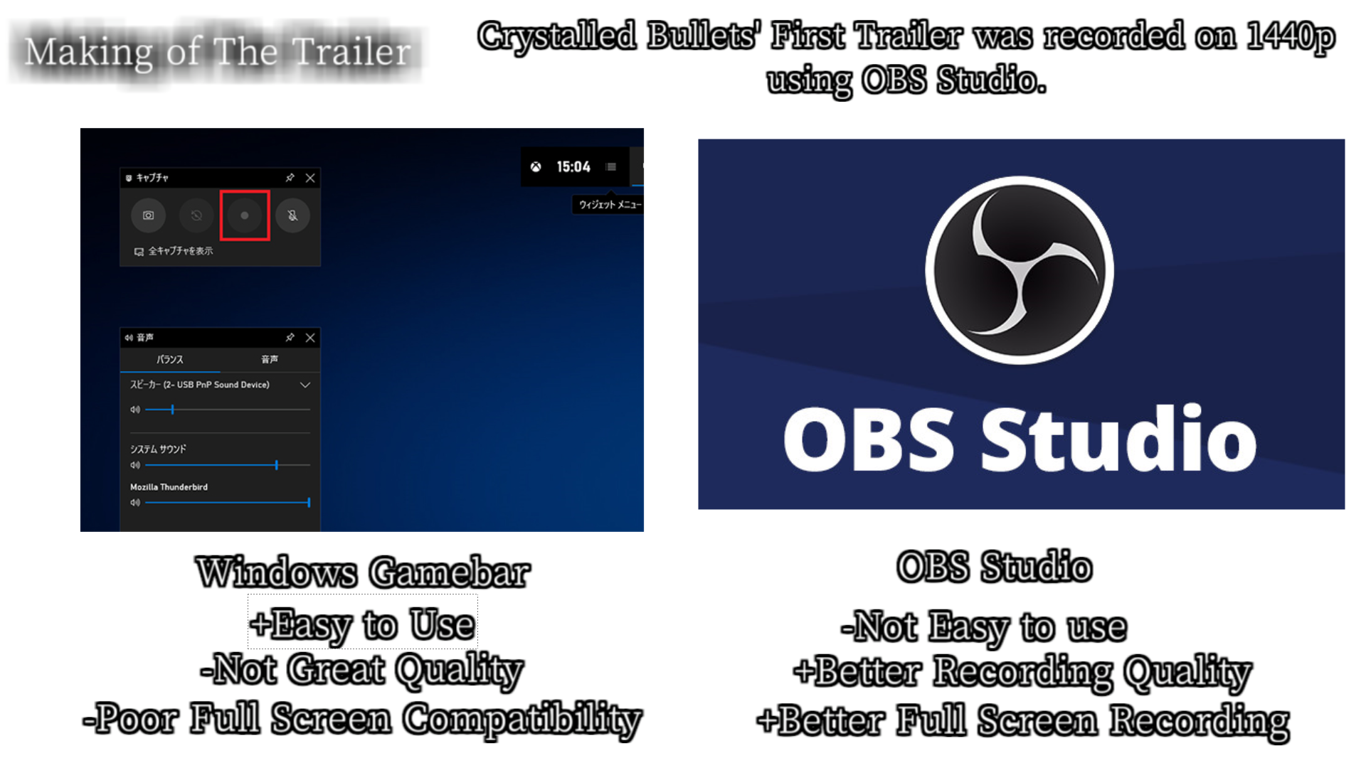
And So, I am ready to film the stuff. I usually use Windows Gamebar for recording, because It's easy to use, but in Trailer, I used OBS Studio for recording. It's better software to record something on higher resolution, higher quality than usual.
As for music, I asked one of my friends in Ukraine to compose the music specific to the trailer while in her busy schedule. I wanted to make my game unique, and don't want to give the impression of a bland game with free stock music after all. except for one thing. I used public-domain classic music at the end of the video to give a melancholy atmosphere.
And... after the recording process and editing, the trailer is done! and the trailer was... well, a mixed bag. bit negative side to be honest. For Good thing, It managed to represent the game's rule (i.e. Crystalizing the enemies, Magic Pickaxe Projectile can turn enemy into Health boost Item, etc.) so That's good for 1st rule. As for the 2nd Goal, I don't think it represented well. Some of the people who viewed it confused the game as a Sci-Fi Setting when I'm more meant to be an Anime-like Fantasy. Plus, It's kinda more depressing and scarier than It should be. Especially the trailer's part of the presenting intrigue of the game.
But Most Importantly, It doesn't look so fun! I think the problem is that combat doesn't flow smoothly, due to the things like lack of quick melee actions. which is the current build of the game has now. made the trailer look awkward. I think the game needed more polish to make a trailer. As a whole, I don't like this trailer much.
But the Good Thing is that one of my viewers who watched the trailer was interested in my project. and So provided music for The game, which is really good.
But In the end, Yep. I think being a bit rushed for the trailer is one of the biggest reasons why the trailer didn't click for me.
The moral of this story: Don't rush releasing the trailer, until the game starts looking like fun! ... Still, I'm planning to make another trailer before I release the demo.
Afterwords: So, That's all for today's Dev Diary. Now I have three dev diaries in total. In Japanese, there's a quip called "三日坊主" that means people give up with the three attempts. But at least for me, I managed to release three dev diaries, So I'm not one of them! hurray!
Anyway, Did you notice that I updated my chibi-avatar a bit that now I'm wearing a skull head? I mean I'm supposed to be "Dead" Ruins not "Alive" Ruins. LOL
Get Crystalled Bullets
Crystalled Bullets
This is an FPS game about using magical guns and a magical pickaxe with its own unique ability!
| Status | In development |
| Author | DeadRuins |
| Genre | Shooter, Action |
| Tags | Anime, boomershooter, Fantasy, First-Person, Indie, Singleplayer, vkdoom |
| Languages | English, Japanese |
More posts
- Crystalled Bullets (v0.32 Alpha) - Weapons Showcase83 days ago
- Crystalled Bullets, Alpha demo has been released!93 days ago
- Crystalled Bullets Development Log #4 (2025/01/05 - 05/30)Jun 15, 2025
- Crystalled Bullets - Development Log #3 (2024/09/21 - 2025/01/01)Jan 02, 2025
- Crystalled Bullets - Development Log #1 (2024/01/20 - 05/11)May 11, 2024
- Take a look at Audio Design | Crystalled Bullets - Dev DiaryMar 08, 2024
- How I Design the Weapon | Crystalled Bullets - Dev DiaryJan 21, 2024
- First Step of Graphics | Crystalled Bullets - Dev DiaryJan 08, 2024
- The Crystalled Bullets - First Trailer is revealed!Dec 21, 2023
Leave a comment
Log in with itch.io to leave a comment.